



BLACK STORM COLLABORATIONS. 440ml Label, Full Art


BLACK STORM COLLABORATIONS, Logo. The client, Black Storm Brewery, tasked me with re-branding the identity for their annual 12 cans range, where the brewery collaborate with other breweries across the UK.
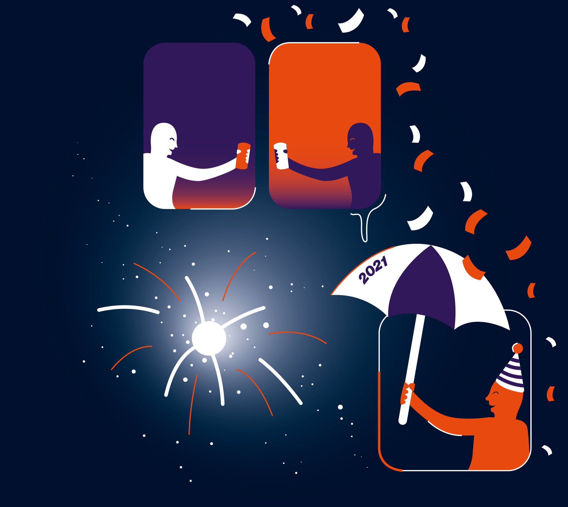
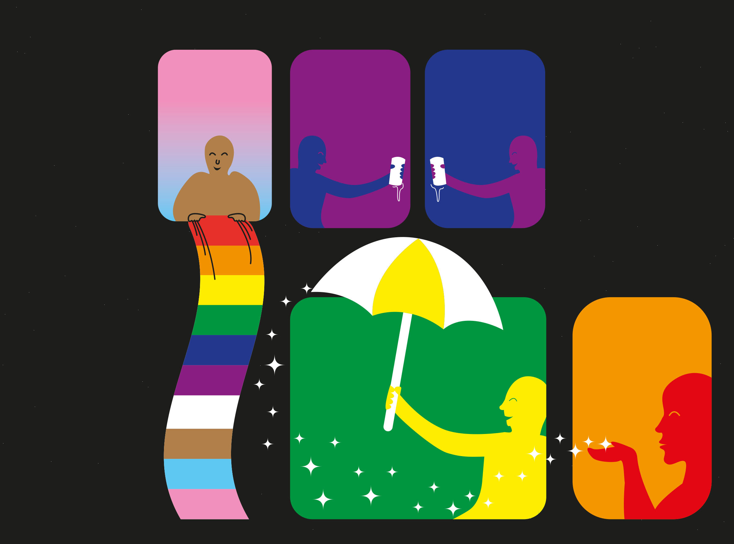
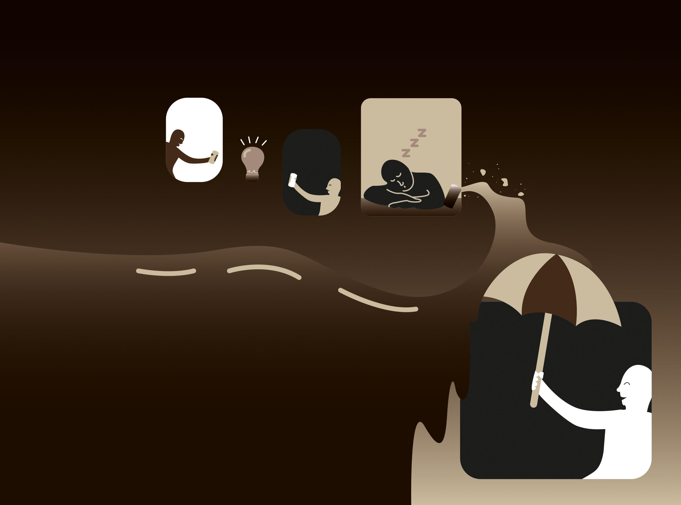
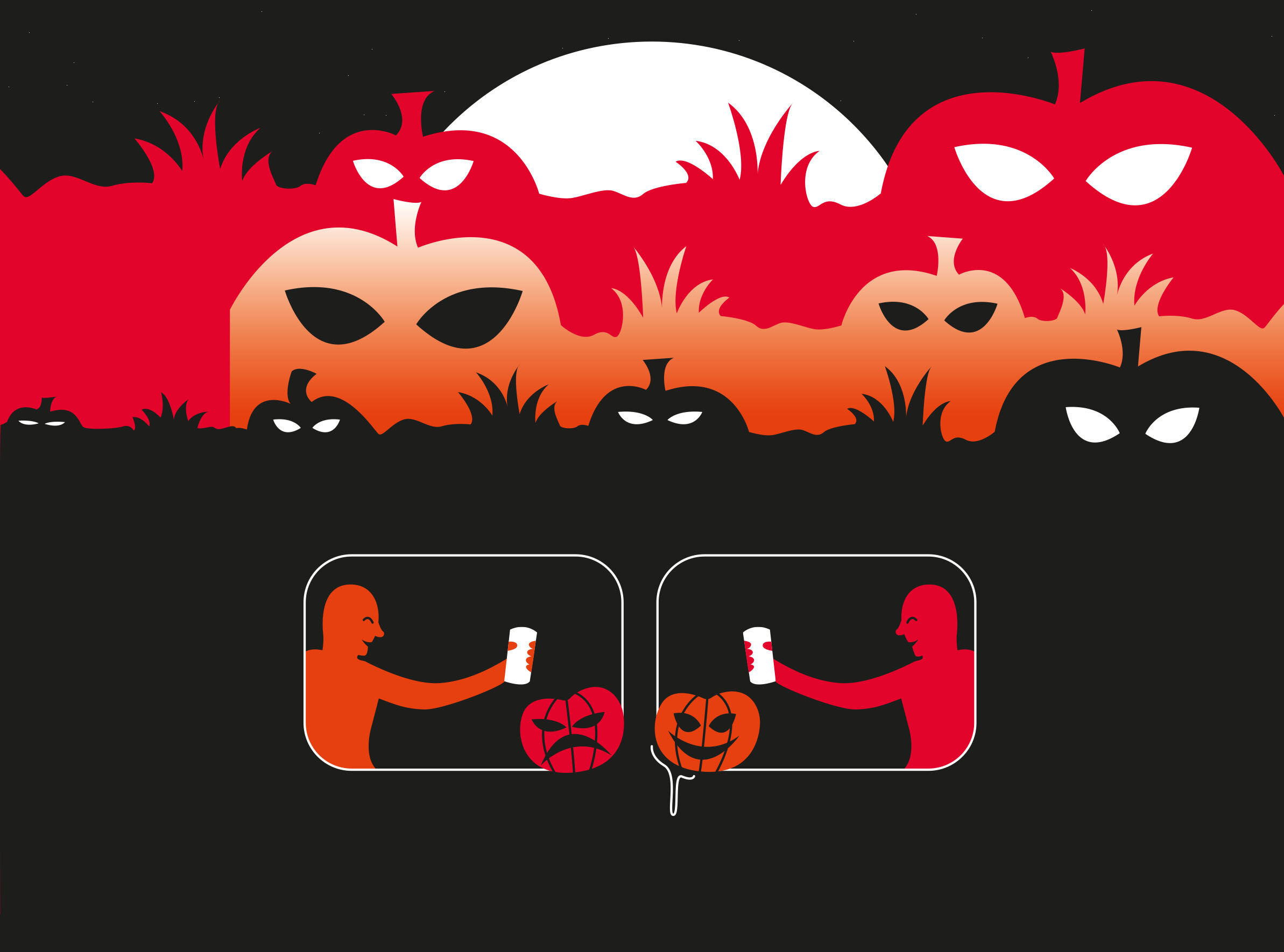
The Client also tasked me with illustrating each of the labels of the range. There are twelve cans in total, so each can represents a specific month of the year. With my illustrations, I wanted each one to represent a different national holiday in the UK.
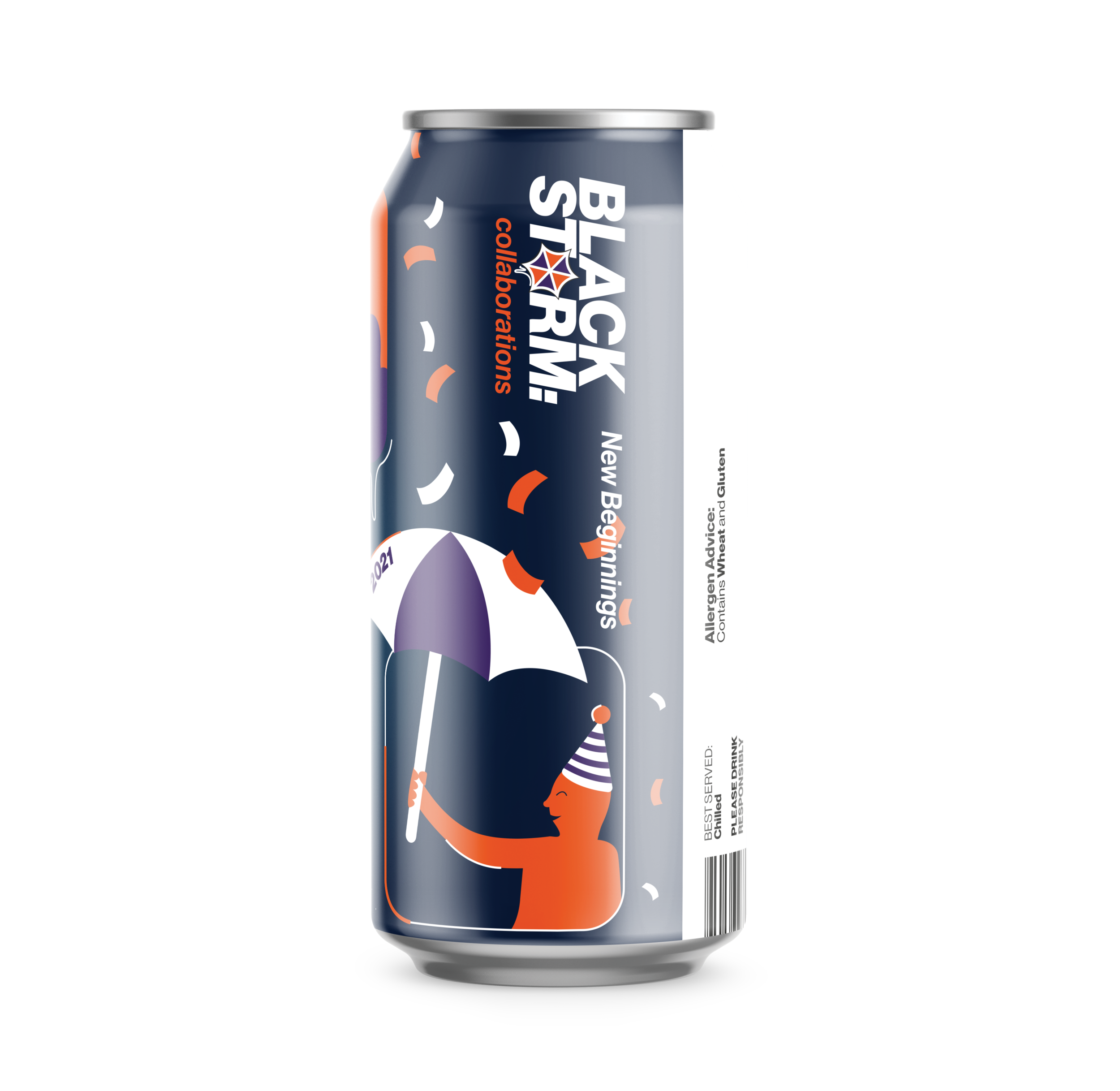
JANUARY
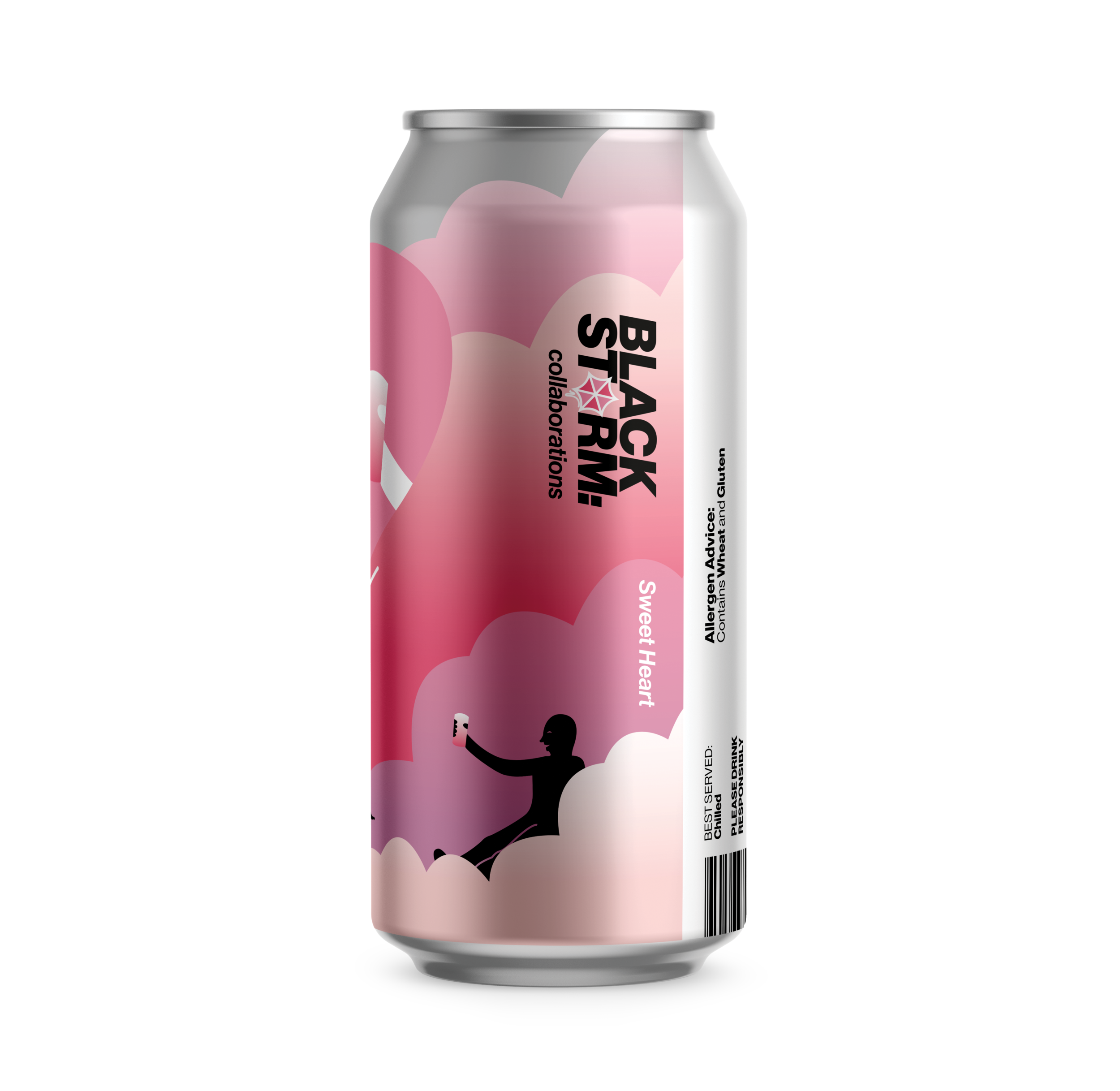
FEBRUARY
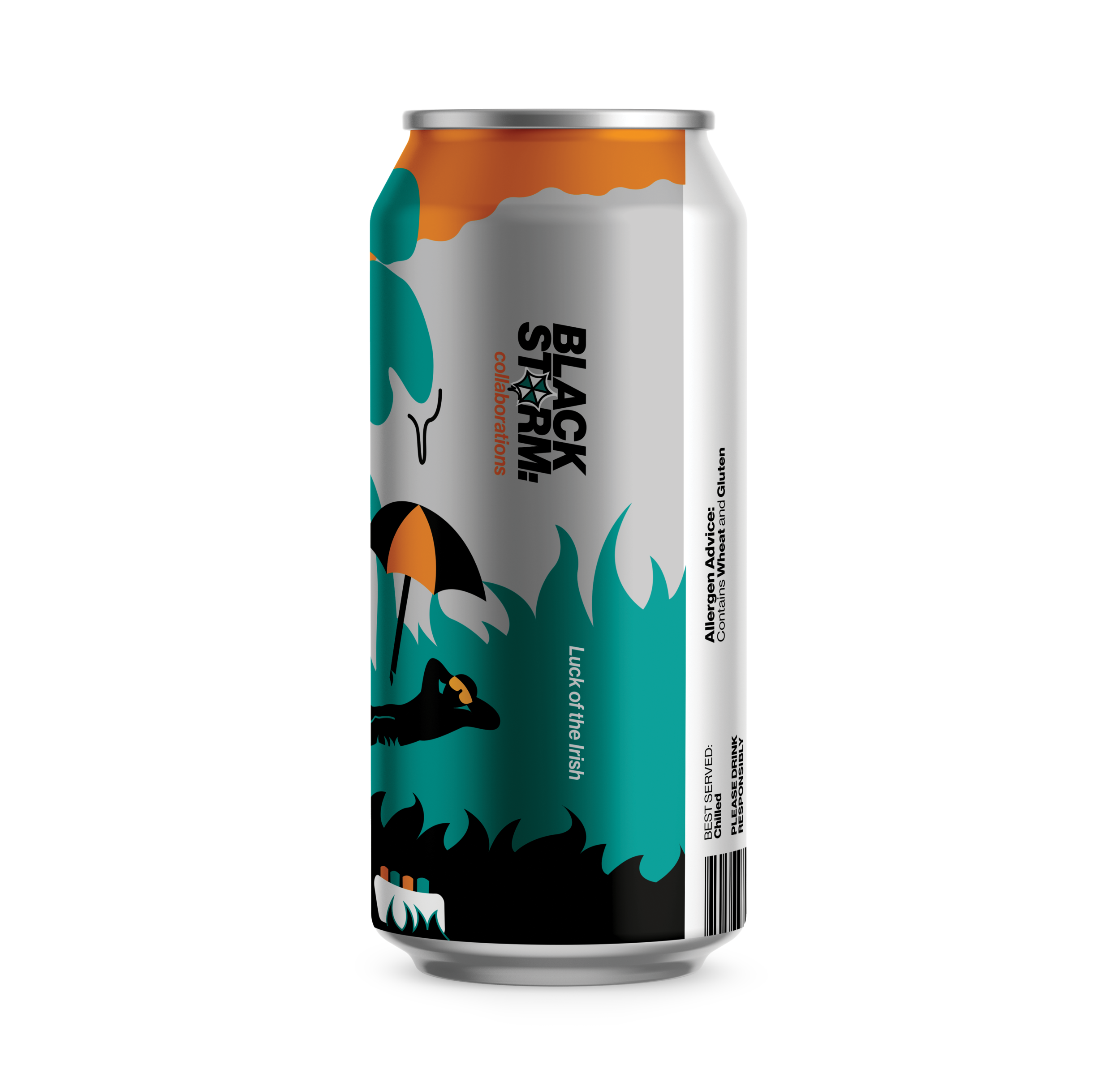
MARCH
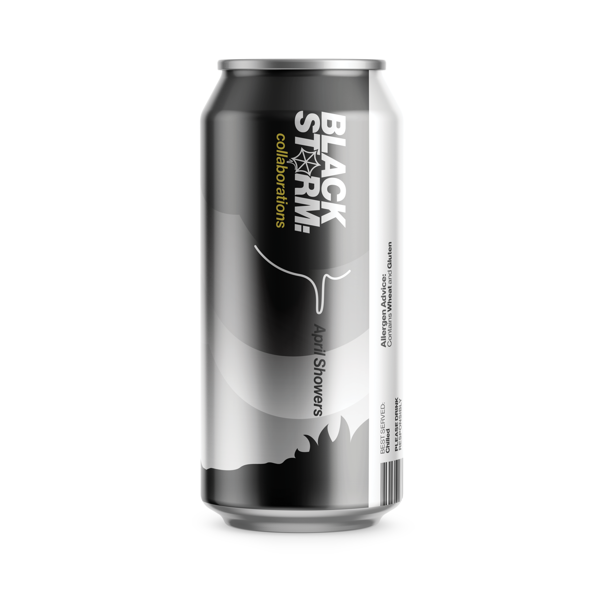
APRIL
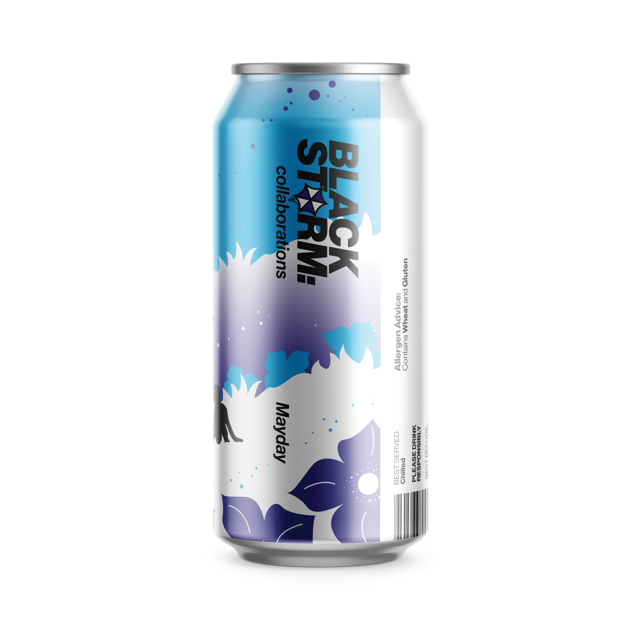
MAY
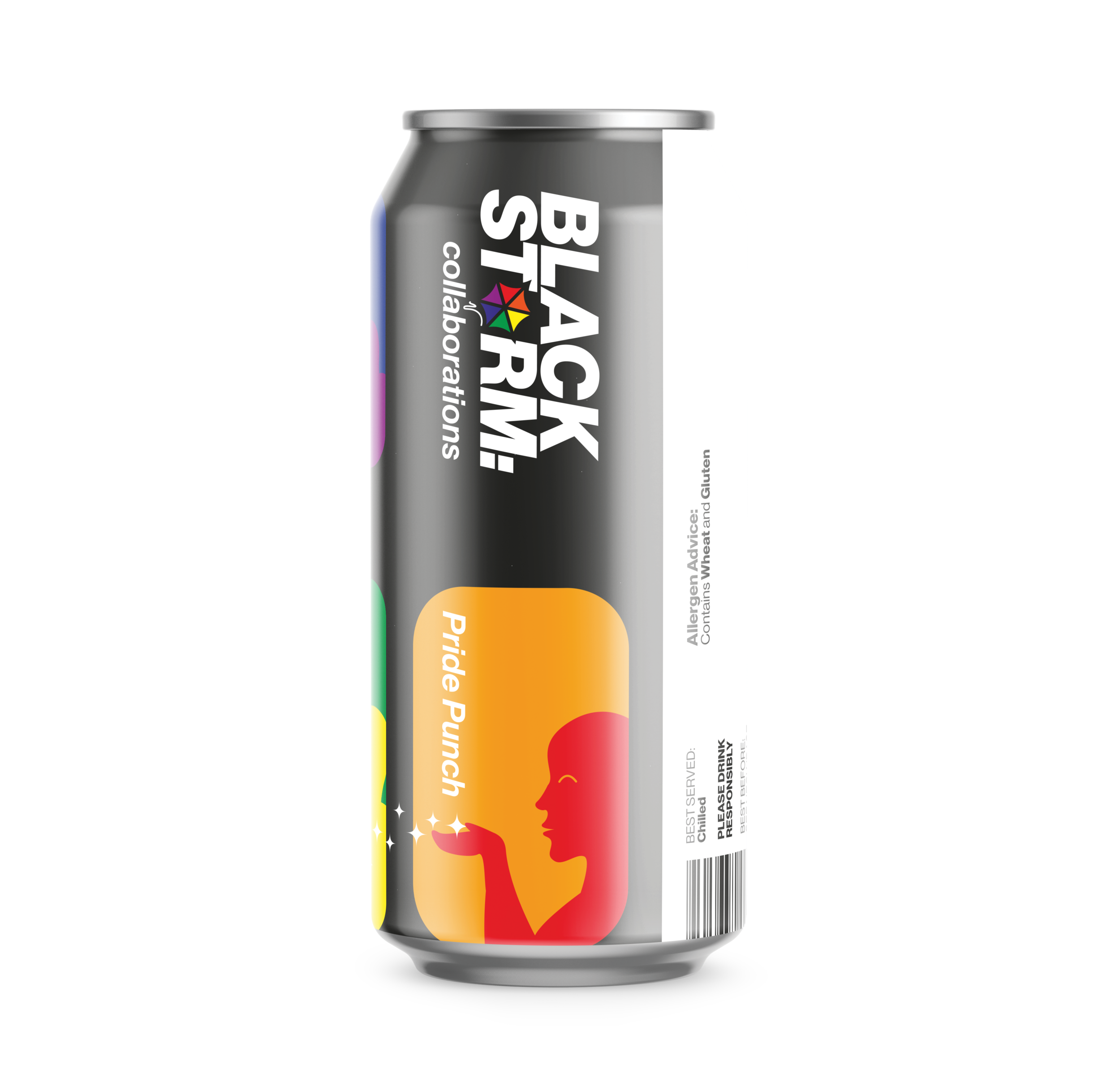
JUNE
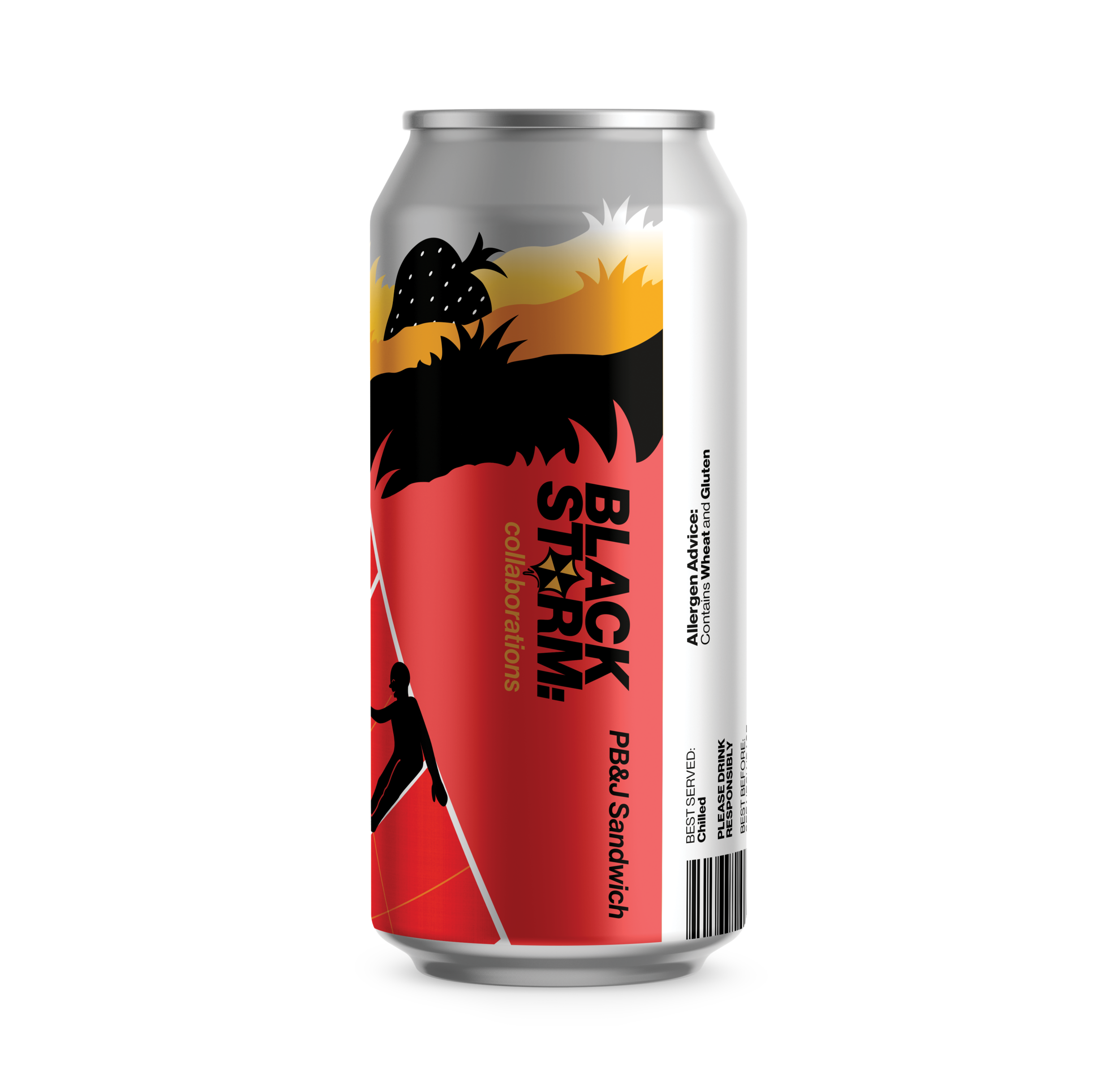
JULY
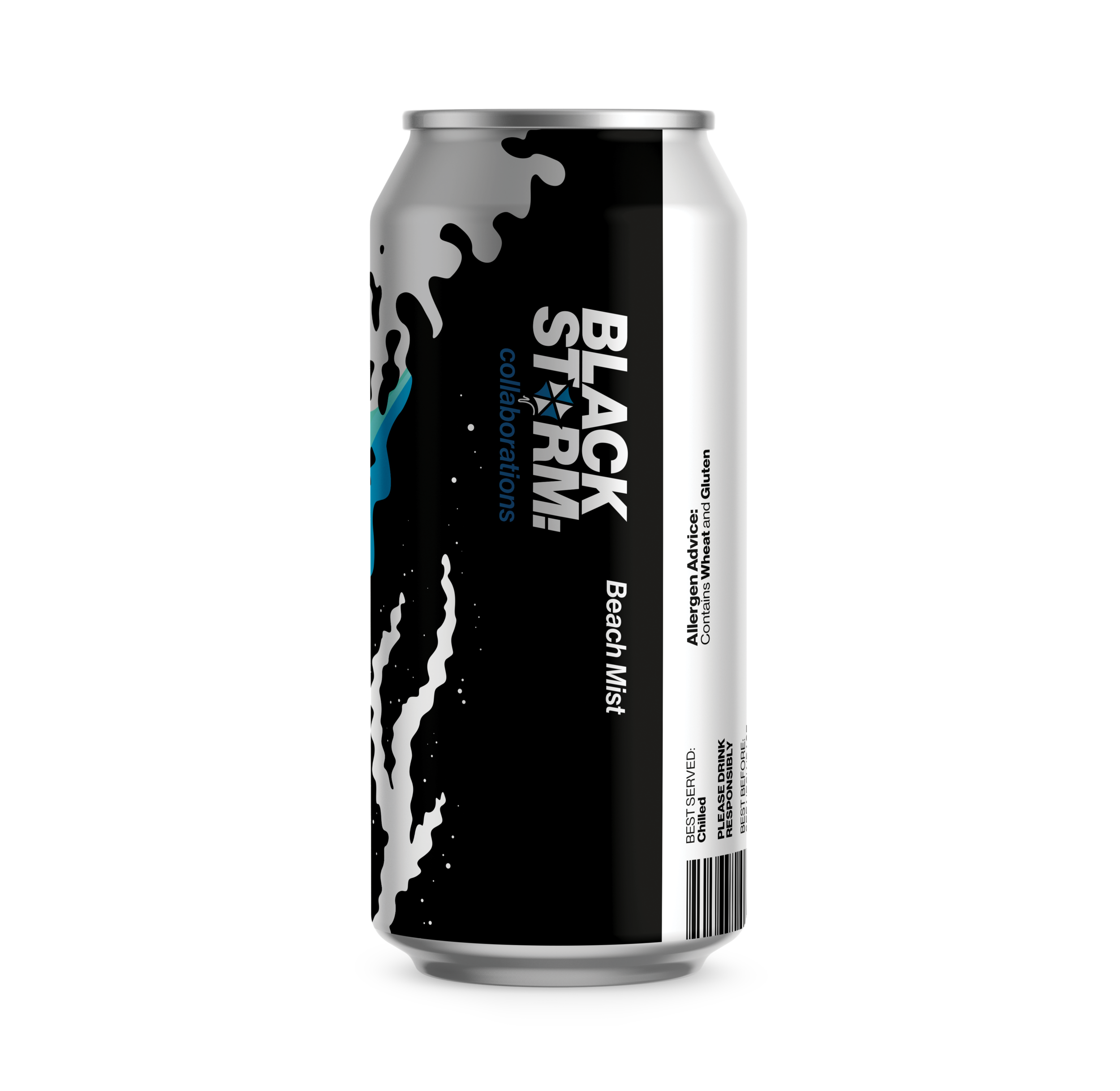
AUGUST
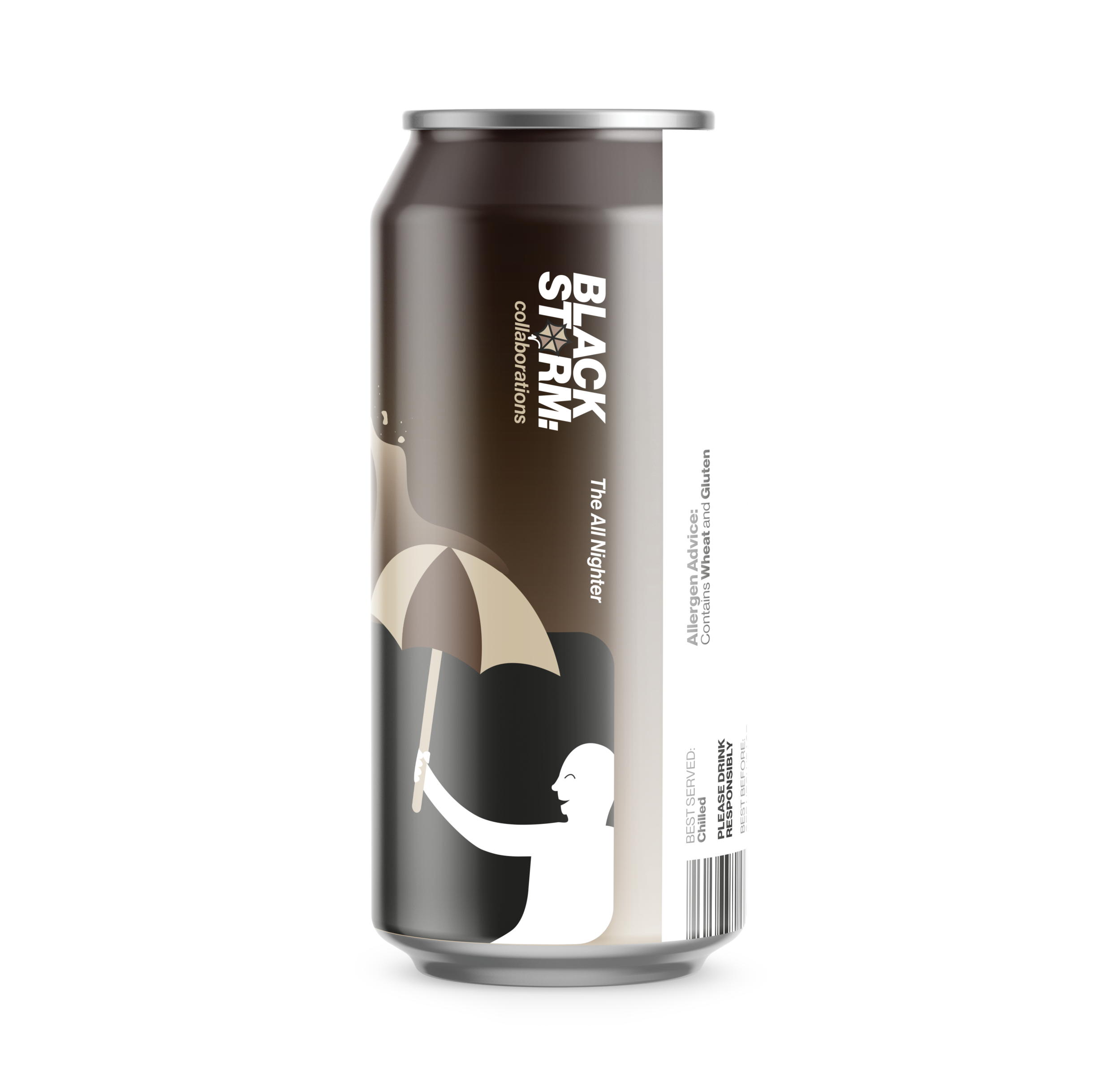
SEPTEMBER
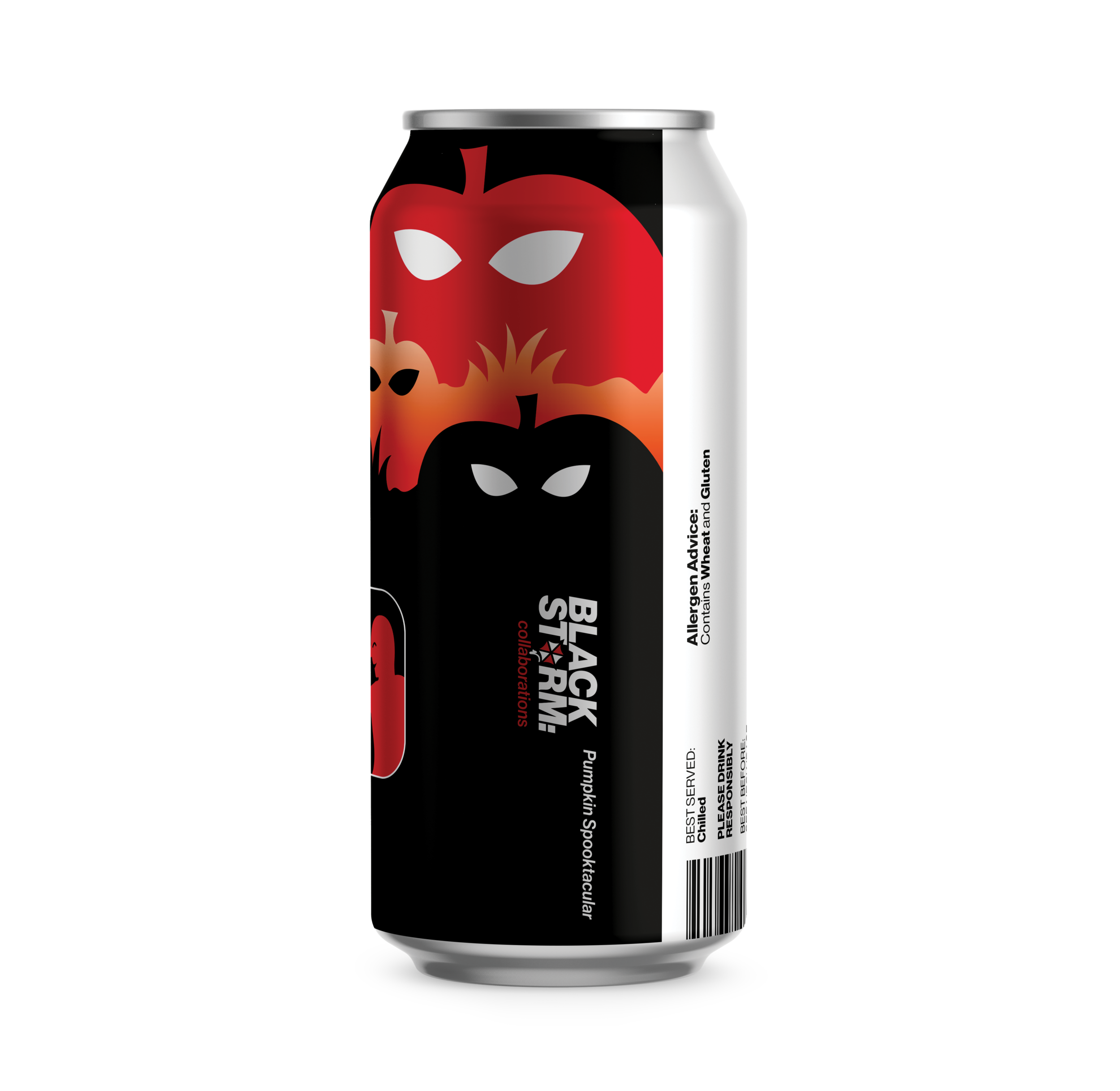
OCTOBER
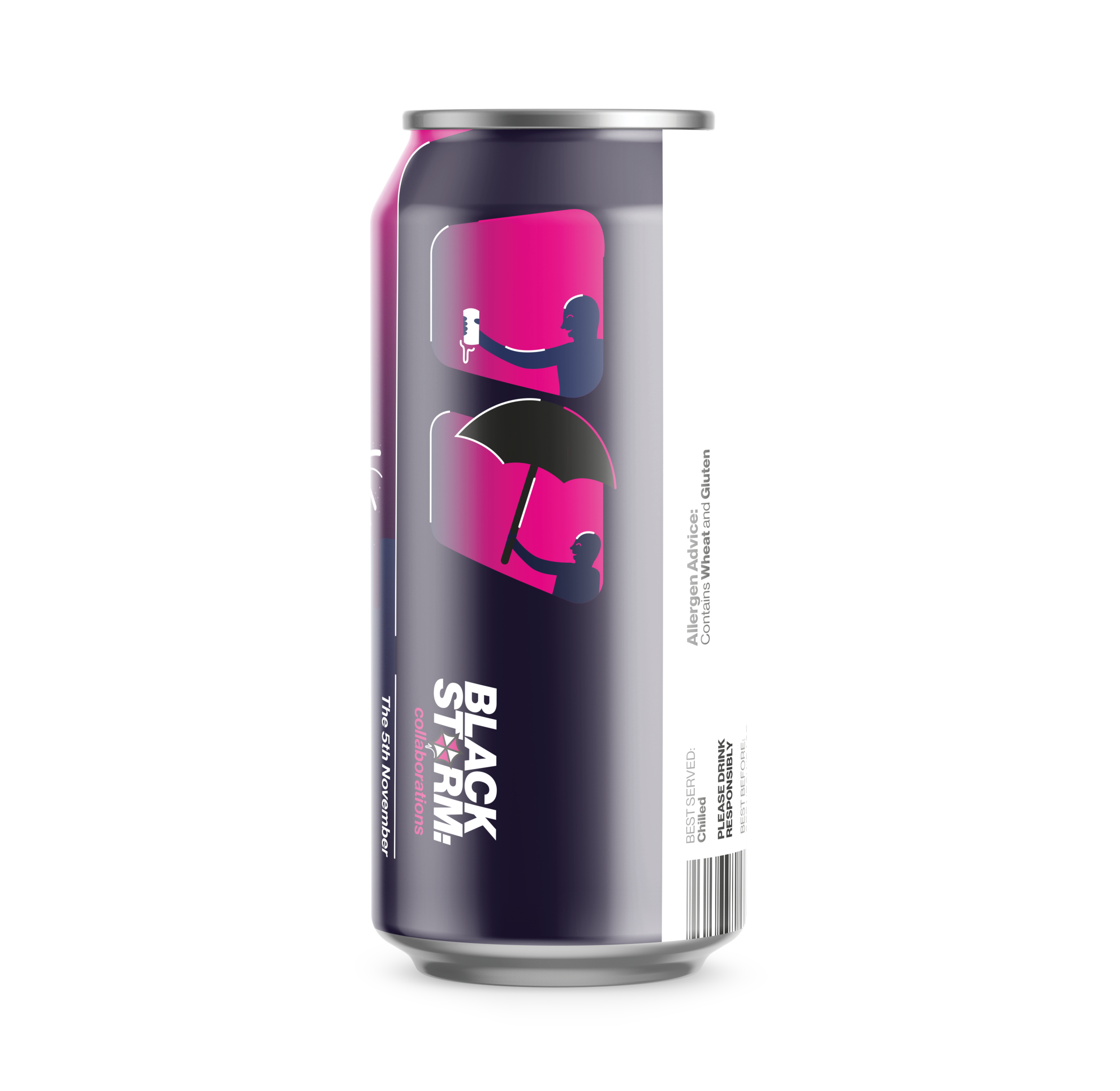
NOVEMBER
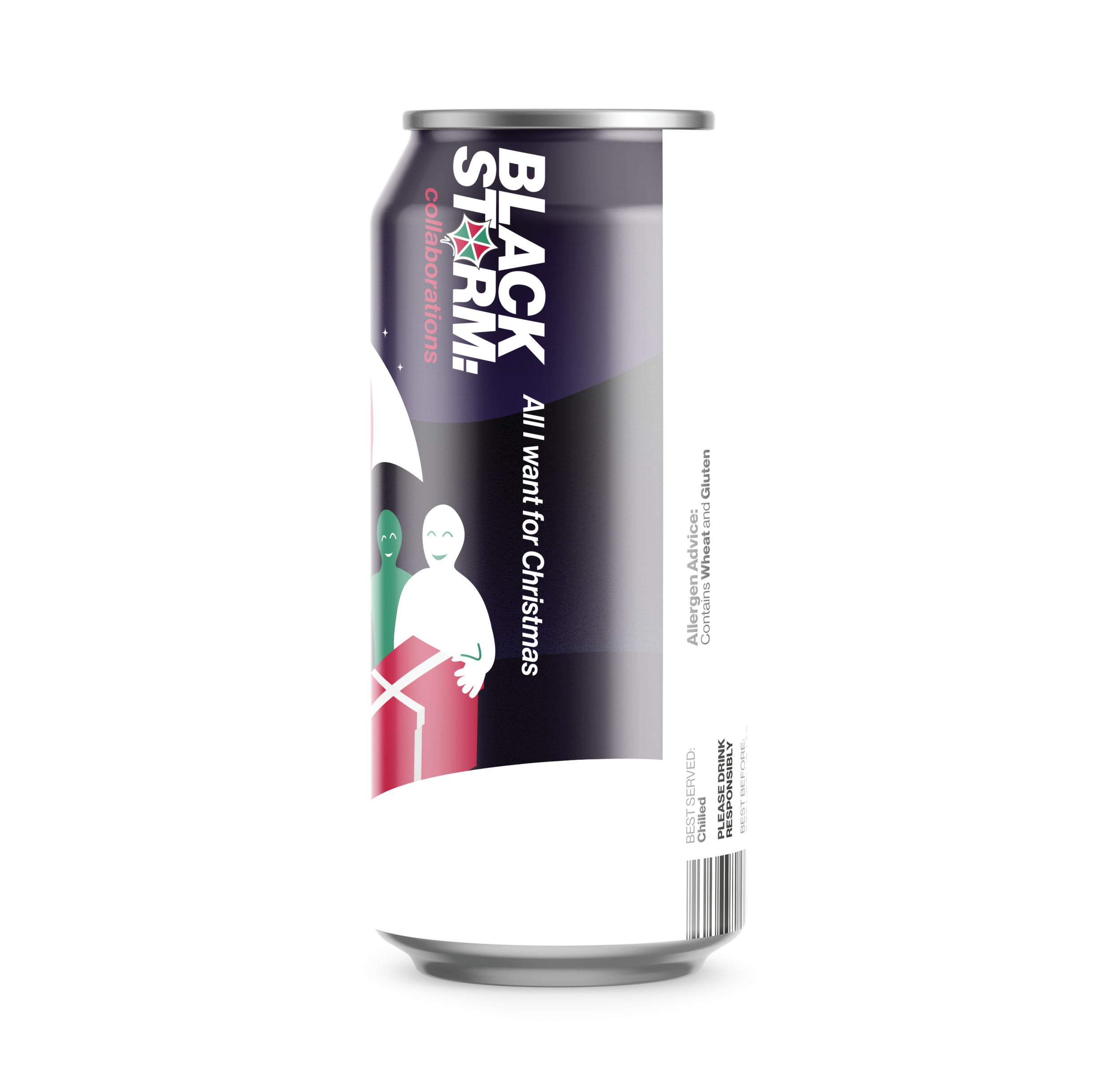
DECEMBER
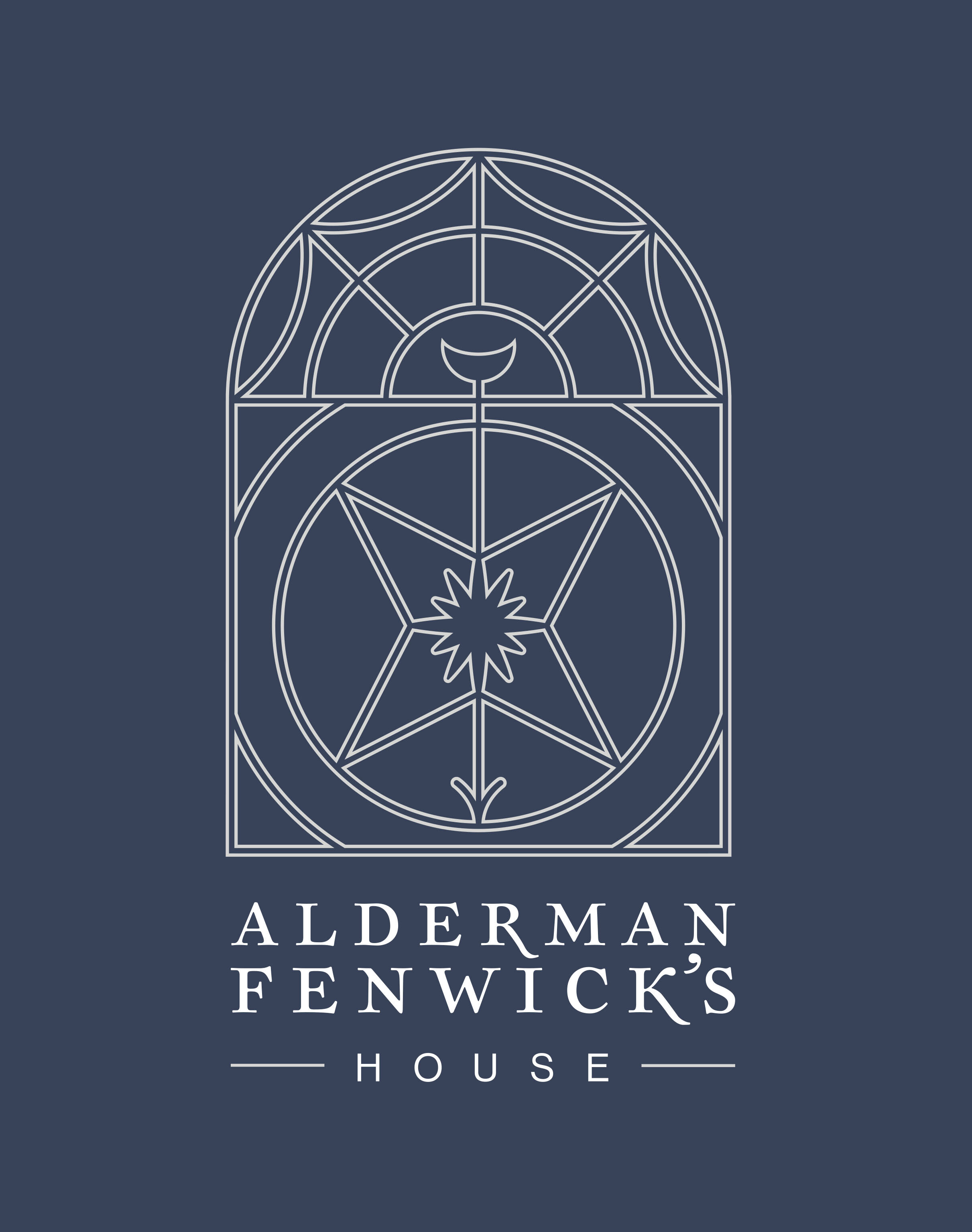
ALDERMAN FENWICK'S HOUSE, Logo. The client tasked me with designing an identity for a historical building located in the centre of Newcastle as they are undergoing renovations for new boutique office and event spaces. The central line work is inspired by many of the unique features of the building’s architecture and interior. The serif type has a classical feel to it, reflecting the history of the building whilst the sans serif adds an air of modernity to the logo.
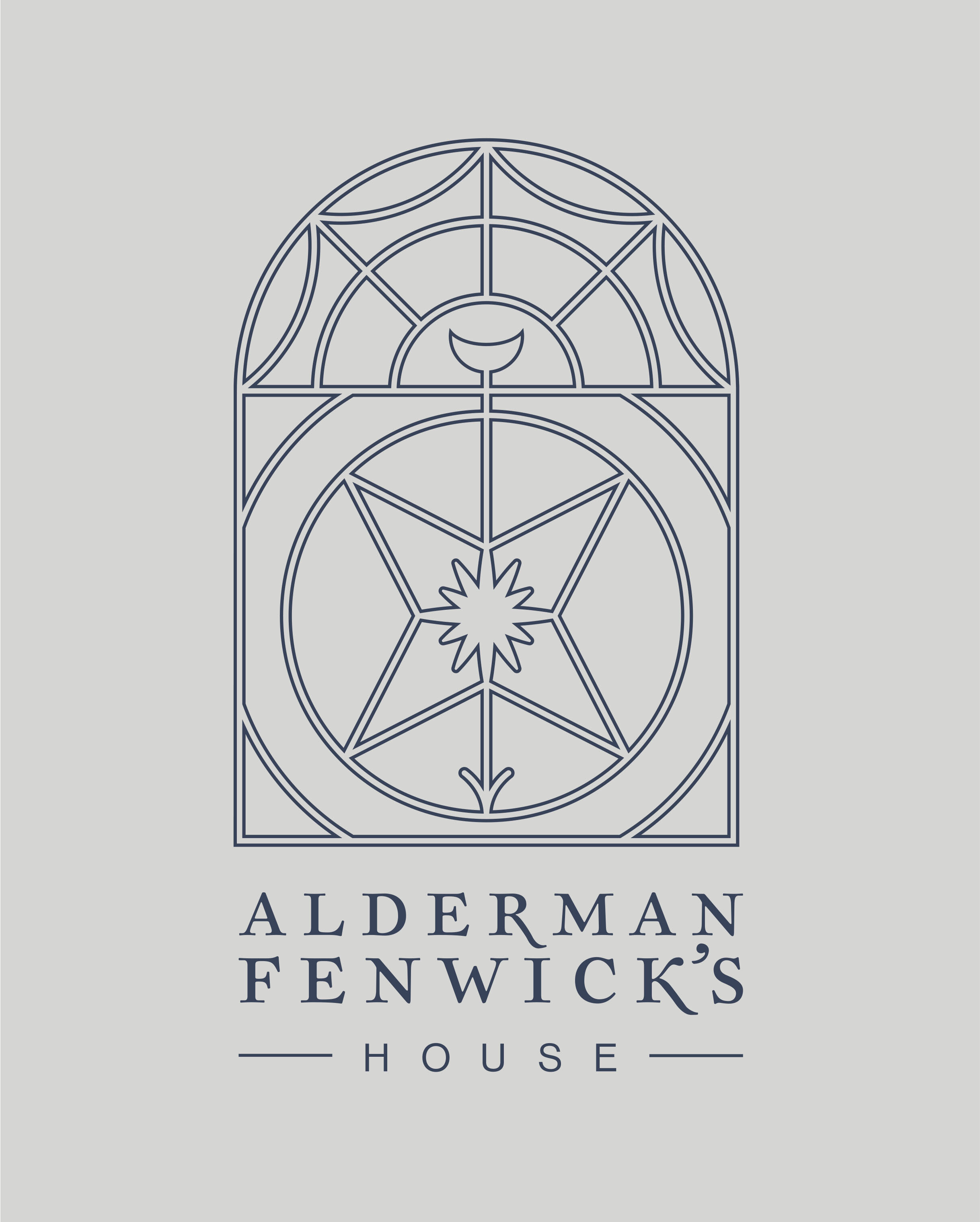
ALDERMAN FENWICK'S HOUSE, Logo. This shows how the different elements in the main artwork of the logo break down for different uses, such as signage for different spaces.
EVERYTHING EDUCATIONAL, Logo. The client tasked me with re-branding and modernising their current logo design. which was originally titled “Everything English”. The brand focus on offering GCSE to A-level support for students around the North East. The two shapes form an ‘e’, which signifies an infinity symbol and in-turn, that the brand has “Everything Educational.
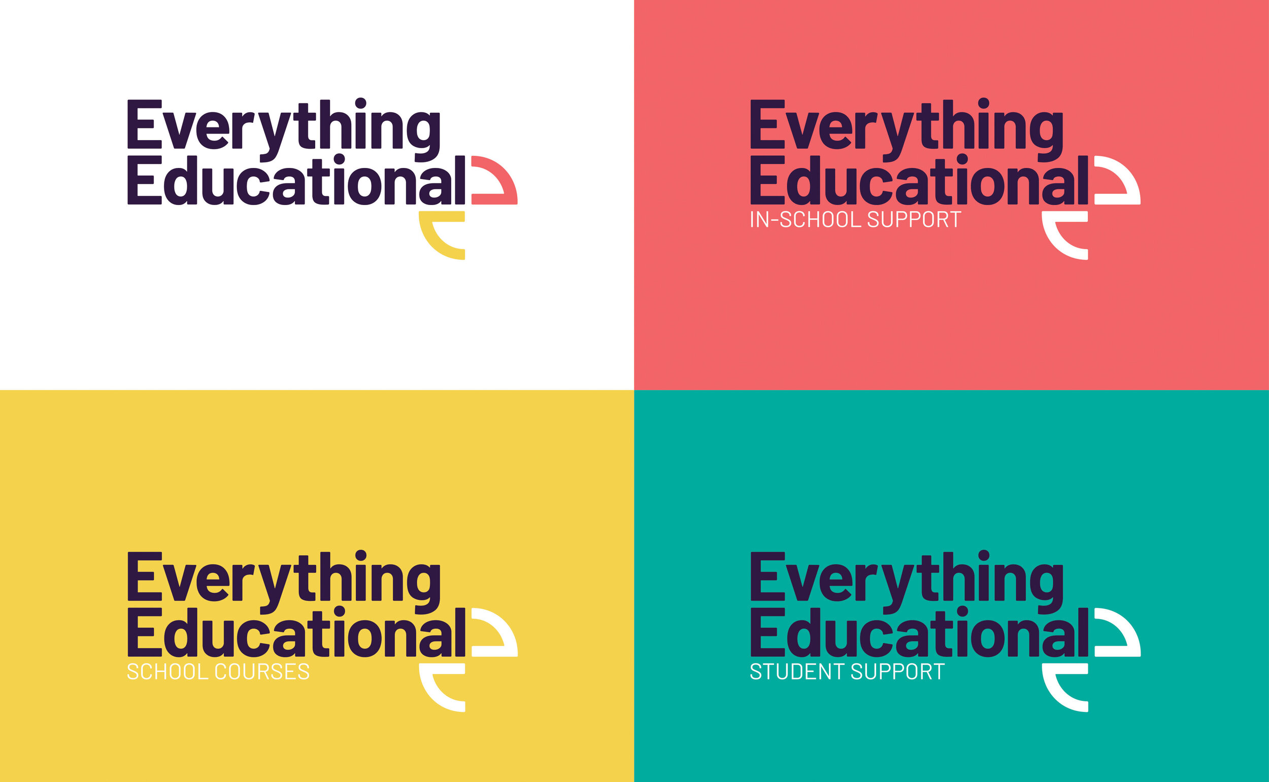

EVERYTHING EDUCATIONAL, Web. This piece displays the possibilities of the logos use on a website. The two shapes can act as individual elements that help frame taglines or other information.
